With over a million apps on the App Store it’s important to choose the right icon. I want something that stands out but also gives a sense of what the app is used for.
I played with a number of themes, including a Superman variant that could link in with some creative marketing. A potential lawsuit with DC Comics put an end to that idea.
SleepHero’s initials happen to be Sh which is of course a noise many parents will be familiar with. This brought a few ‘Shhhh’ icon ideas into the mix.

I quite like the simplicity of this but don’t think it tells you enough about what the app is for.
Then there’s the soft-toned baby/moon combo. It fits in well with the app purpose but then again there are many simple “white noise” apps on the store which adopt this approach. Too dull.
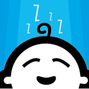
Despite gaining an A at GCSE Art I found myself floundering around with layers and palettes in Photoshop. Perhaps it was time to call in an expert. Enter Ryan at Rio Design who created a few but this is my current favourite:
All feedback greatly appreciated!
If you’d like to take part in beta testing of the SleepHero app then please contact me.